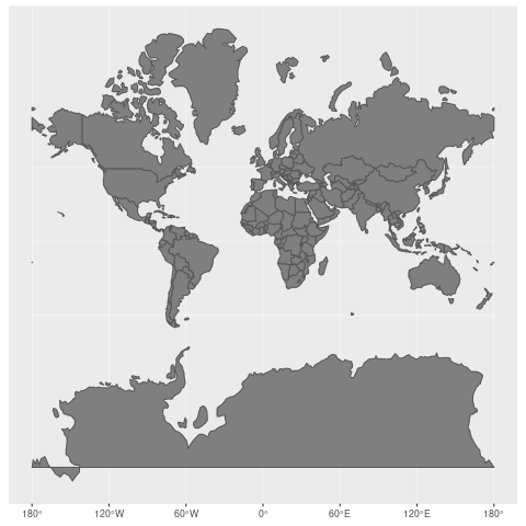
Maps twist our perception of the world. Countries closer to the equator—which happen to be poorer1—seem smaller than they are.
This is because the world is a 3D sphere, but maps are 2D projections on a plane. That means distortion!
Source
The original post has a lot of other fascinating visualizations of it. And here’s a website that lets you drag things around to see how the sizes compare.
I knew this was a thing but I didn’t realize the effect was that pronounced. Look at Greenland! It goes from the size of Africa to 1/14 the size of Africa.
West Wing did a whole thing about this:
Maps that show true sizes are called “equal-area projections” such as the Gall-Peters projection, Albers projection, and Mollweide projection. Here’s a list of them if you’re interested in this rabbit hole.
Thanks for reading! Subscribe via email or RSS, follow me on Twitter, or discuss this post on Reddit!
